

A touring orchestra with no permanent home recently faced a branding problem most businesses never have to think about: how do you build one recognisable identity for an organisation that performs in a different building every week? The designers' answer was a logotype built from a typeface that reveals new details as it's slanted — angled differently for each venue, but always unmistakably the same mark underneath.
It's an elegant solution to an unusual problem, but the underlying idea — a logo designed to flex rather than stay perfectly rigid — is increasingly showing up in far more ordinary branding, from app icons that shift with dark mode to identities that adapt across formats without losing recognisability.
What "Flexible" Actually Means in Logo Design
A flexible logo isn't a logo that changes randomly. It's built on a fixed underlying structure — proportions, a core shape, a consistent typographic logic — with specific, intentional parameters allowed to vary: angle, colour, cropping or a secondary element. The rules are strict; the execution within those rules isn't.
This is different from simply having multiple logo variants (a horizontal version, a stacked version, an icon-only version). Adaptive design means the mark itself is designed to respond to context, not just be resized to fit it.
Why This Trend Is Growing
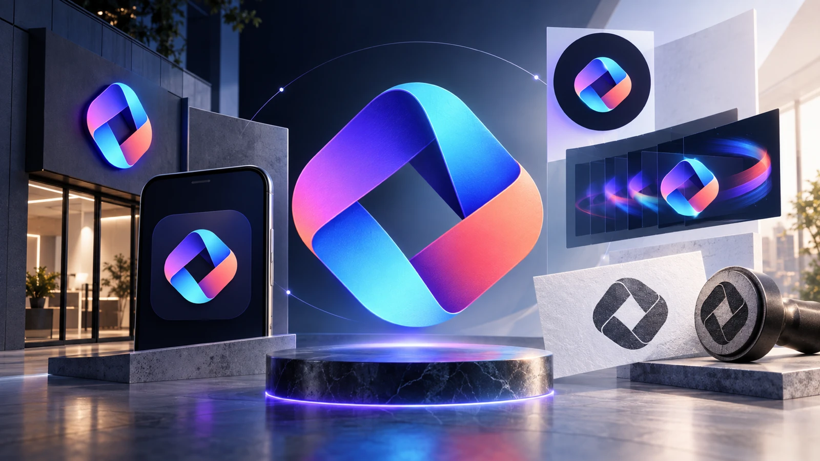
- Brands live across far more surfaces than they used to. A single static mark rarely looks right identically on a website favicon, a delivery app icon, a storefront sign and a social avatar.
- Motion is now a default expectation. Digital-first audiences expect logos to do something on load, on hover or on scroll — a rigid mark can feel stiff by comparison.
- It signals a living brand. An identity that can subtly shift while staying recognisable reads as dynamic and current, rather than fixed in time.
The Risk: Flexibility Without a Foundation
Adaptive logo systems only work because there's an extremely disciplined static mark underneath the flexibility. Skip that step and "flexible" just becomes "inconsistent" — customers stop being able to tell whether they're looking at your brand or a variation that's drifted too far from it.
This is the trap smaller businesses fall into when they chase this trend without the groundwork: a logo that looks different everywhere it appears, with no single strong version anyone can actually describe from memory.
Does Your Business Need This?
Most small businesses don't need a logo that bends and shifts across dozens of contexts — that level of system is built for organisations operating at real scale and complexity. What almost every business does benefit from is a core mark strong enough to work as a static version everywhere, with one or two deliberate variations (a simplified icon, a single-colour version) built in from the start rather than improvised later.
Get that foundation right, and you'll have covered 90% of what adaptive branding is trying to solve — without needing the complexity that comes with the rest.
Want a logo that works everywhere your brand shows up?
We design every logo with the variations you'll actually need — icon, single-colour and responsive versions included. Packages start from $29 with a 100% Money Back Guarantee.
See Packages